About me? I'm a designer with a lot of experience in education. Off-screen products that connect with on screen experiences is what I do.
Yoga Studio App
Yoga Studio is a social experience that connects
hikers, runners and bicyclists online. Users connect
offline in the yoga studio. This design is still in progress.
User Flow
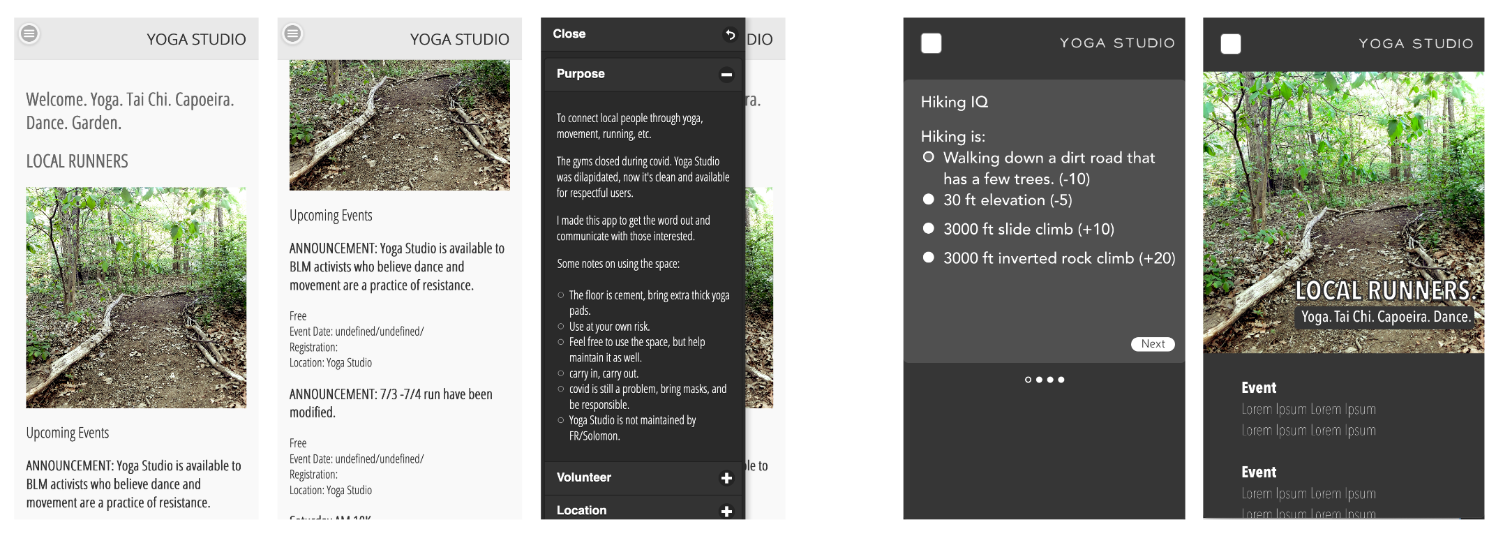
Yoga Studio has a landing page with athletic events listed.
Using the landing page, users can scroll through and register for events.
Using the settings panel, users can learn more about the purpose of the app, change their preferences or profile settings, or socialize with other users.
User Testing
Objectives:- do users scroll through events?
- do users click on menu to engage social aspects of app?
- are users ‘drawn in’ to offline participation?
Tests
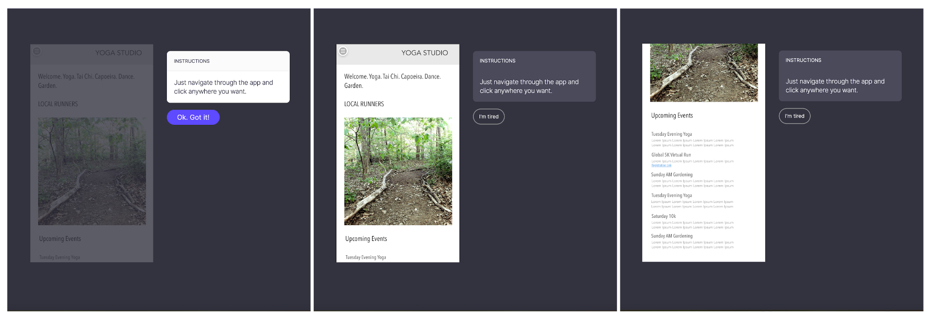
Open Analytics Test
This open analytics test tests objectives 1 & 2.The user is given unlimited amount of time to click on landing page interface.
The test determines user instincts regarding first click vs scroll. Suggests relevance of photo real estate.
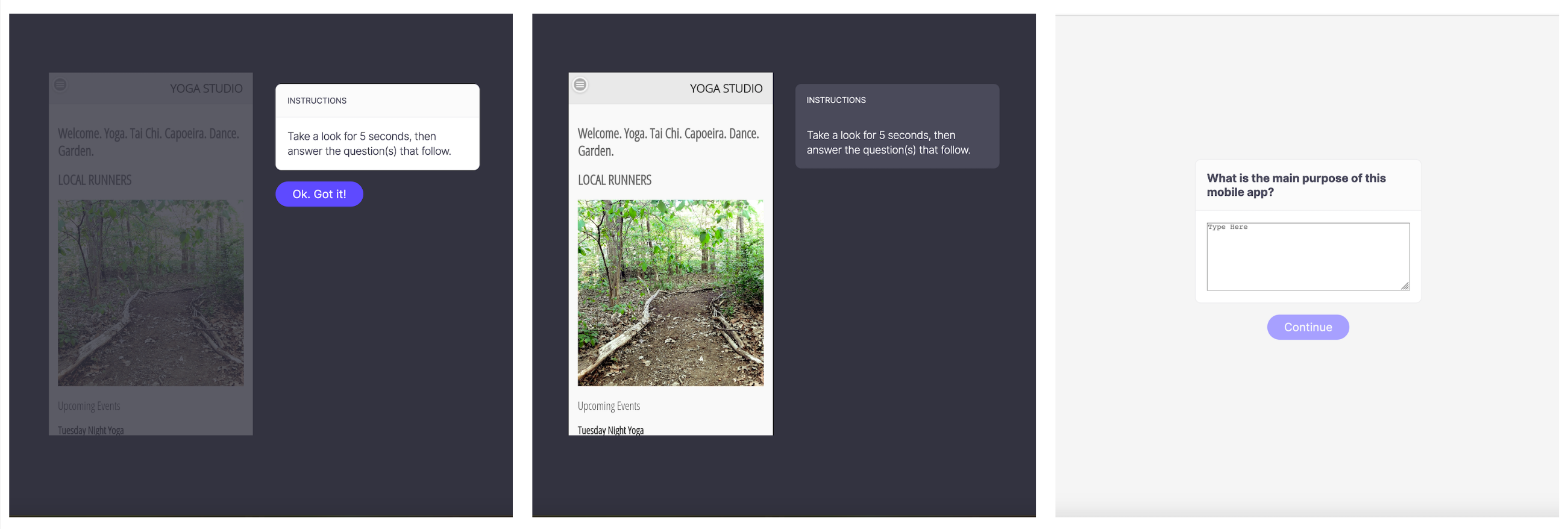
5 Second Test
This 5 second test tests objective 3.The user looks at landing page for 5 seconds
User is asked their initial impression of the app based on landing page.
Determines user impression - is the user aware of both online and offline activity, and intent to connect offline?
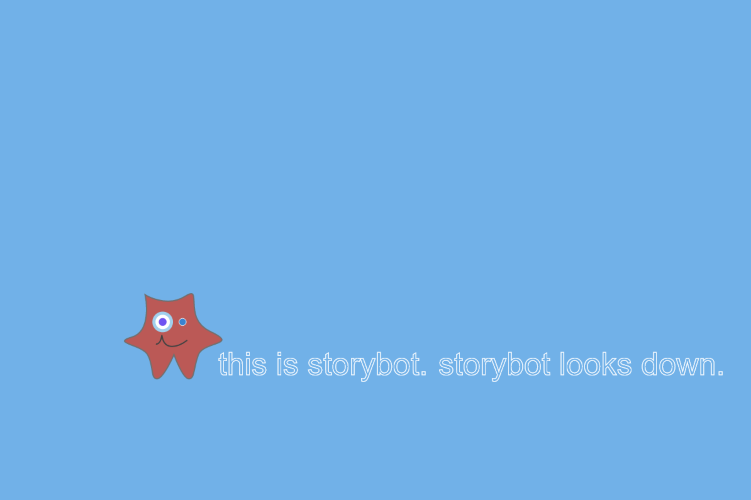
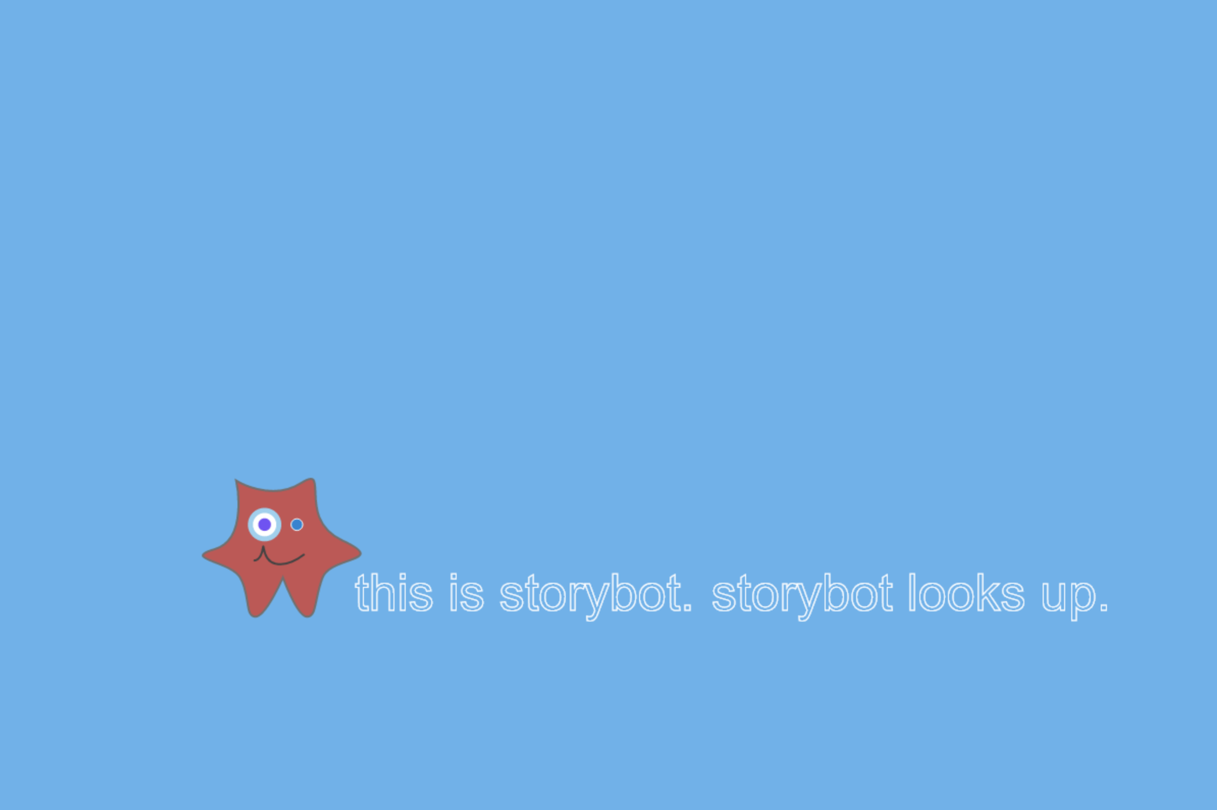
Storybot
The Storybot design is still in progress. This is a brief glimpse.
Storybot is a learning to read toy. Children imagine and play via gestural animations of the stuffed toy. As they move the toy, text is written on screen for children to read along with.
Discovery tests have exposed a dilemma. Should the toy come with preprogrammed gestures and stories, or should children train the toy to illustrate and narrate their imaginations.
Ridesharing Interfaces
Warning: Material Sensitive to Victims of Sexual Exploitation
Ridesharing Apps have two types of users,
riders and drivers.
The riders hail drivers in exchange for a fee.
As employment, ridesharing is a low barrier to entry
employment option. This design is still in progress.
Discovery Process
I drove for both Uber and Lyft for about one year, developing user experience design insights.In the context of sex trafficking victims, and low barrier to entry employment options, one question I asked:
How likely are victims of sex trafficking to recognize visual interface exploits?
What did I discover?
Linguistic triggers as passive threats.UI/Visual Exploits - Login Phishing.
UI Test Design
User Personas
Before designing tests, a user sample for interaction testing requires personas. Who are victims of sex trafficking?
Test Design
Users are presented with a visual interface, and asked how comfortable they are putting their login credentials into the interface.Linguistic Triggers
Blatant or overt requests for sexual services in
exchange for money are rare.
Requests for such services will be masked in passive
communication to avoid arrest.
Those seeking sex in exchange for money will use masked
terminology, sometimes suggesting violence.
"Submit"
"John"
A lot of software use the archaic terminology "SUBMIT",
a default interface button.
It doesn't lead the user to clear action the way
'SEND', 'CONTACT', 'CONNECT', etc do. It is also
triggering for victims of sexual exploitation.
Uber does not still use this word. Lyft does.
The following UIs communicate linguistic triggers. The
left is spoofed/hacked, the right isn't.
UX Test Design
5 victims of previous sexual exploitation are presented
with the spoofed interface. Conduct this test twice.
Once with no triggering event, and again after being
sexually harassed by a rider. Users selected for both
ride sharing experience and sexual exploitation
experience.
UI/Visual Exploits - Login Phishing
How easily do users (drivers) recognize this interface as a 'spoofed' interface, designed to phish for information?
Below is the user flow of a spoofed interface designed for information phishing.
Conclusion
As a professional designer, my views are objectives and geared toward solving problems. Independent research allows me to work objectively to expose problems, and design solutions. This work focuses on exploits of the visual interface and user perception. It is important to note, this work is not intended as a smear campaign. I have no affiliation with any ride sharing businesses.If prepared with this information, ridesharing might be a possible work opportunity for those looking to escape sexual exploitation. Many sex trafficking victims have limited employment history outside the sex industry. Low barrier to entry employment has potential. Without preparation, ridesharing can be incredibly stressful for drivers, a problem amplified by victimization.
Uber partnered with ECPAT, Polaris and several other organizations to mobilize its drivers in the fight against sex and labor trafficking. In 2020, Lyft followed suit. As I drove, I watched Uber change, empowering women riders and drivers. Lyft also required drivers to go through sexual harassment training, a means of preparing drivers for safety.